Taking Charge

Having time to reflect on our trail ideas, I wasn’t sure how effective they would be. I am no expert on trails, but my experience of publishing has taught me that things should be as simple and concise as possible. Having three separate trails on different bits of paper can become confusing, not only for visitors but for the staff as well. This would not meet one of the key criteria set – trails should be self directed.  Another issue is that each trail is designed for a different age group, I felt that having them separate may be restricting, particularly for younger children if they don’t feel they can participate, and we want avoid tantrums where possible!

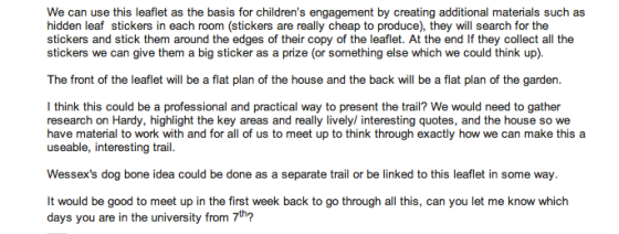
The ideas we had come up with were good, but needed pulling together into one publication that can be accessible to all ages. I took the initiative to sketch out ideas (see below) of how we could present the different trails together in a fun, creative and engaging way.

Thomas Hardy NT leaflet flatplan

I proposed my idea to Hannah and Clare in an email, where I clearly detailed the format of the leaflet and how the trails would  work. They both really liked my idea and we arranged to meet up after the Christmas break to discuss in more detail.

Screen Shot 2013-05-08 at 19.30.22Screen Shot 2013-05-08 at 19.30.40

Presenting Articles

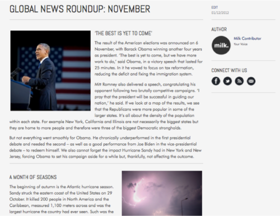
Before the milk. lesson I went into the publishing lab. One of the downfalls of the site last year was the presentation of articles. I was keen to present them in different, exciting ways to make them more readable. Gavin talked me through ways of presenting articles differently. Using and understanding HTML was essential for this, and I quickly began to pick it up. Together we laid out an article:

Screen Shot 2013-04-28 at 21.12.38

This layout looked far more professional than those in last years milk. The difference was purely attention to detail. Pictures sourced were of an extremely high quality. A simple line was used to break up stories. A classy font was used for subheadings. Widows and Orphans were avoided. Text was carefully edited to fit the layout rather then the other way round. Spacing was added evenly to balance the article. The hierarchy of titles and subheading works well.

These tips from Gavin gave me the confidence to layout articles in an interesting way.

The milk. lesson was a bit of a blur, there were so many things to run through for the first issue launch next Thursday. With Gavin’s help I talked the team through uploading articles to WordPress. Everyone seemed happy and the editorial process all seemed to be running on course. Caroline created a spread sheet and assigned jobs to people in the class to make the uploading process easier for everyone.

Gavin also took team photos of everyone to add to the meet the team page. Below is a screen shot of my photo:

Screen Shot 2013-05-09 at 22.47.21